Project Summary: Improve the product details page on the e-commerce site GreatBigCanvas.com and improve its conversion rate metrics.
Project Overview
Great Big Canvas is a print on-demand e-commerce website where shoppers select from a library of tens of thousands of licensed images of art and photography—from well known to obscure—and select a size and framing style to have the artwork printed and delivered directly to their door.
GOALS & OBJECTIVES
As part of the conversion rate optimization strategy for the website, I was asked by internal stakeholders to audit the entire site and assess where changes might yield the greatest benefit while adding the least amount of effort to the dev team’s volume of work.
MY ROLE
- Conduct a discovery to determine pain points, friction areas, and drop-off in traffic across the site.
- Design and present proposed solutions to the UX / UI of the site based on findings.
- Collaborate with the internal company creative director to retain brand continuity throughout the project.
- Work directly with dev teams to discuss progress, as well as feature feasibility / scope.
- Provide mock-ups, wireframes, animation samples, prototypes and final assets.
- Review, test, and approve dev progress to ensure vision was executed on effectively.
- Conduct qual & quant studies to confirm and validate problems and solutions.
- Build and groom a UX/UI backlog for planning and strategizing future improvements.
Identifying Areas of Concern
For an e-commerce site like Great Big Canvas—grossing considerable revenue each year—changing the existing product page presents a high level of risk; even when conducting a 50% traffic split A/B test. I wanted to ensure that the level of research I conducted generated enough supporting artifacts and concrete data to formulate a solid foundation on which I could build our own testing and UX improvement hypothesis.
DISCOVERY
Quantitative analytics data and funnel analysis indicated that visitors to the site were spending a good deal of time on product details pages, but showed a significant absence of those users actually adding their product to their shopping carts.
Initial heat mapping and click behavior data suggested that users were spending time changing the options of their product, but this analysis did not provide adequate insight into what was preventing them from finalizing their decision.
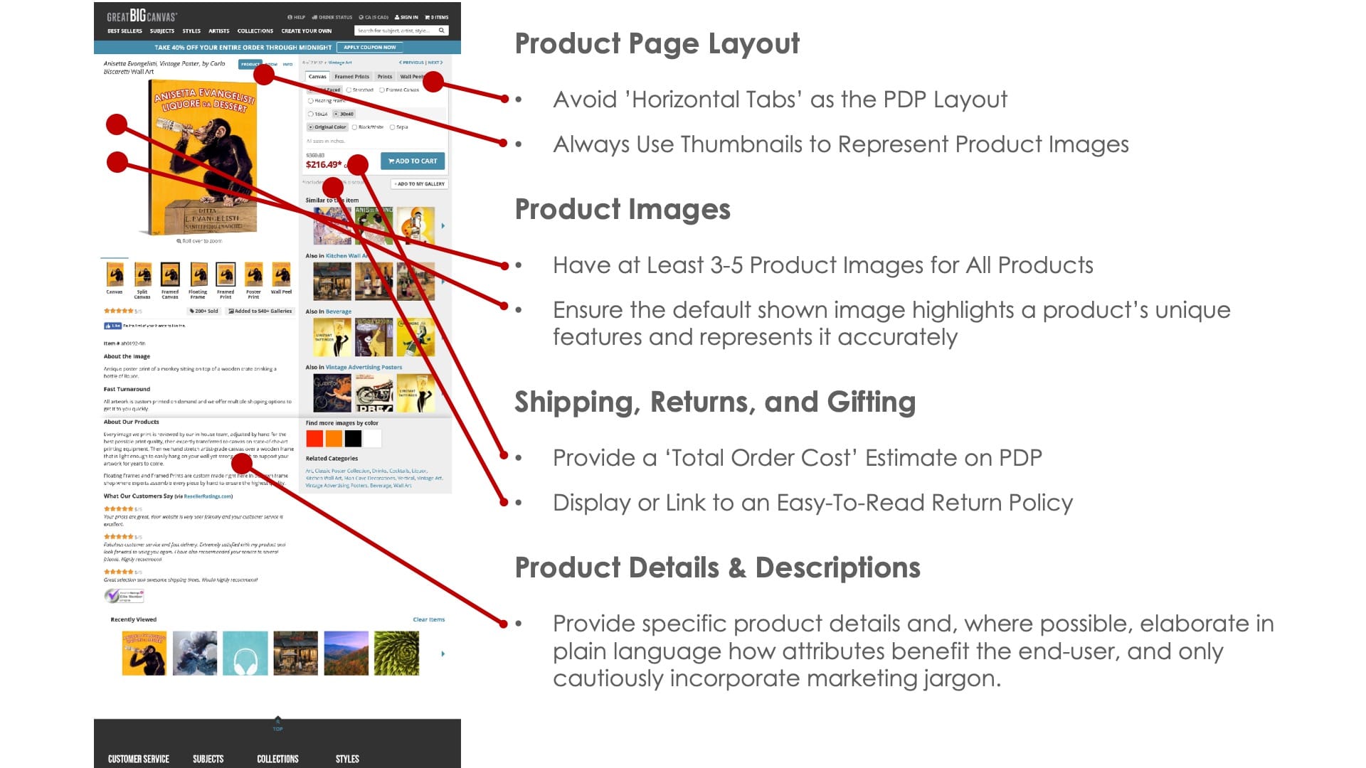
A fully customizable product means the buyer’s journey and user flow differs from the more common shopping experience of an inventory-based, e-commerce site. Education and visualization of the differences between products are crucial in assisting a shopper with their decision making. Initial evaluations of the page determined that there were some considerable improvement opportunities available by simply updating some of these UX best-practices.
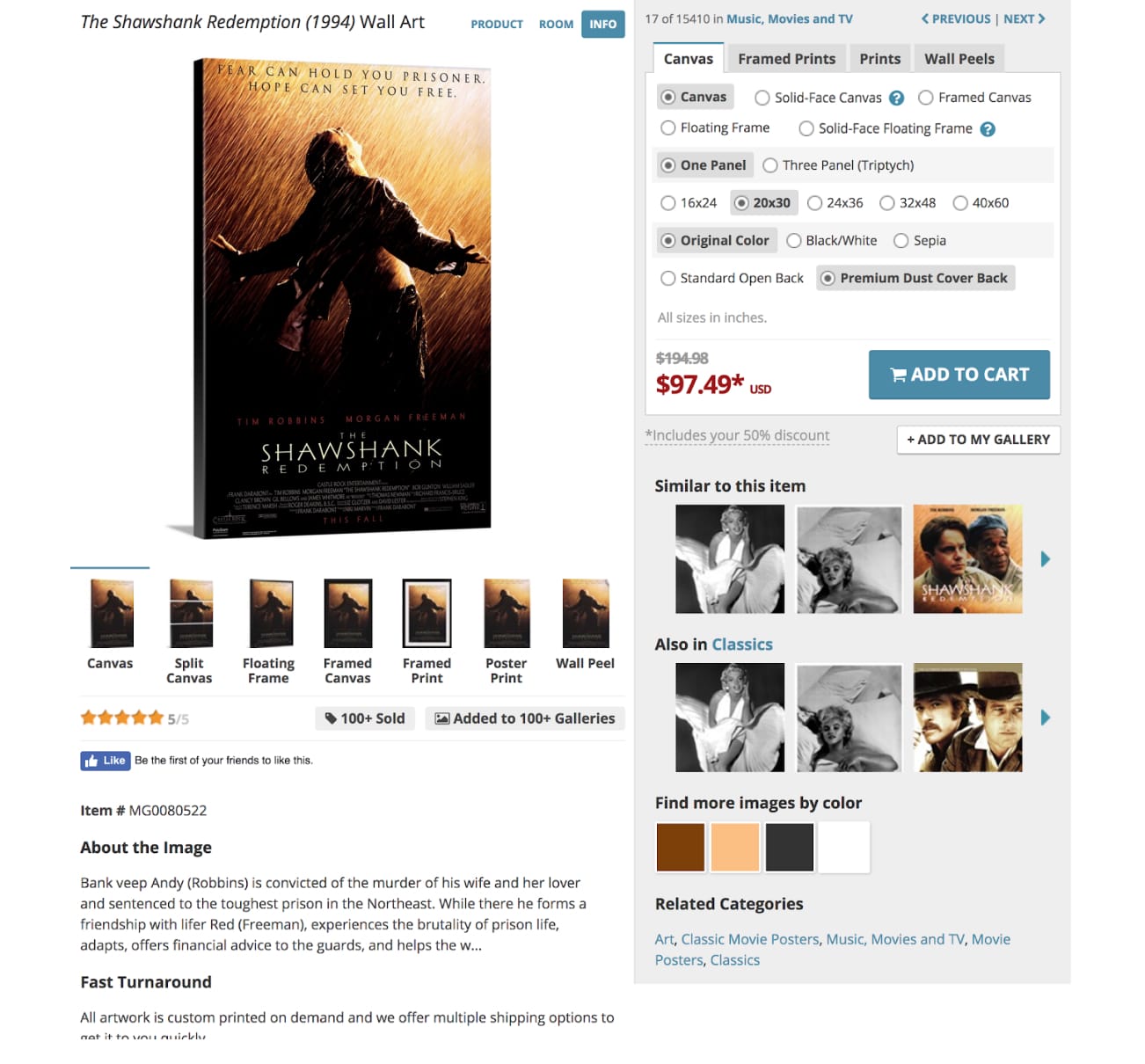
Below is a screenshot of the old product page as well as a screenshot of the audit artifact I used to identify potential pain points and issues from a “best practices” perspective.
USABILITY TESTS
In addition to benchmark evaluation, I developed and ran a series of usability tests and surveys to observe users and confirm suspicions concerning the initial summary audit. Those tests included:
- Anonymous feedback solicited directly from the page via minimally interruptive survey widgets.
- Observation based, unmoderated usability testing, where participants were sourced from our specific demographic and designed to walk users through our site as well as two competitor sites with similar interfaces.
The results of these tests confirmed our suspicions that users preferred the experience of competitor sites due to a lack of education, visual examples, and detailed information on the product page. After sharing my findings with project stakeholders, I was given the green light to proceed with the redesign.
Redesign Phase
Once this preliminary research and analysis was complete, the design process moved relatively quickly. The creative director and I iterated on layouts for the page, developed prototypes, and shared these designs with the creative and development teams for feedback.
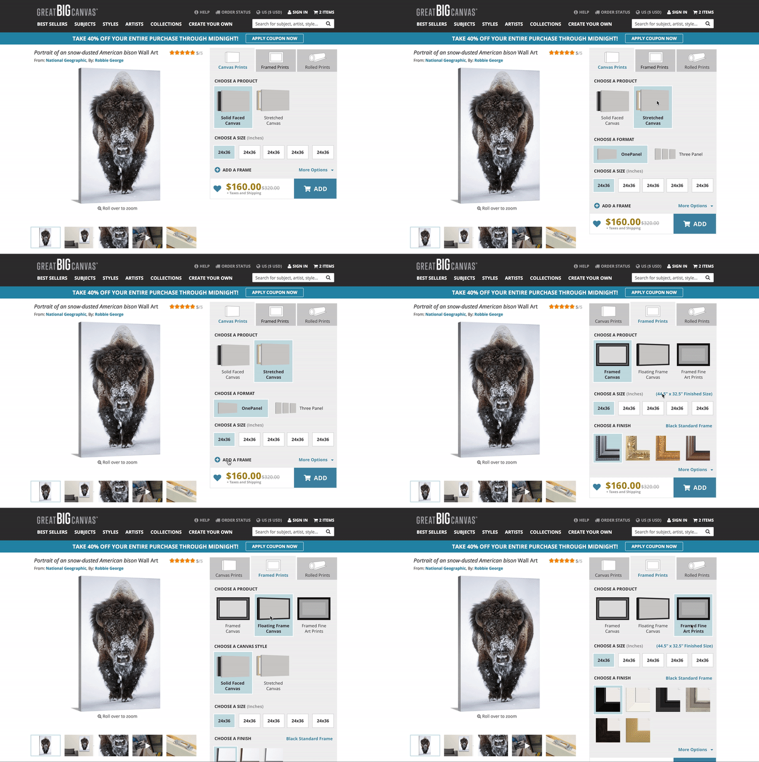
We also evaluated the new designs of the page based on the same benchmarks and best practices we used for the existing design of the page and conducted additional rounds of observational usability tests of these prototype pages.
IMPLEMENTATION
Once the design of the page was approved by internal stakeholders, development lift was relatively light (less than a month) due to the inclusion and collaborative effort during design. When complete, an A/B test on 50% of the traffic confirmed that the candidate page outperformed the existing page by a considerable* amount.
We also conducted some final rounds of usability tests identical to those conducted prior to the initial phase to verify the newly designed pages would do better with users. The results were all extremely positive—with most users preferring the newly designed pages over both of the competitors sites.
*Due to limitations set by NDAs & confidentiality agreements, specifics have been generalized.
FINAL DESIGN
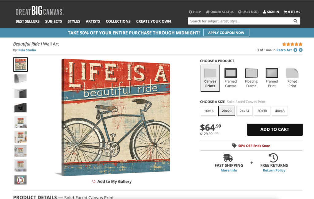
A link to the live version.**
**Edit since original post — It has been over 3 years since completing this project and—while they have undergone a re-brand since, and I am no longer designing for this company, the layout and functionality of these pages have largely remained the same.
Conclusion
In addition to successfully designing a better performing, more robust, and enriching user experience for Great Big Canvas’ product pages, the research conducted beforehand produced a substantial amount of backlog items not included in this version of the page. Those items provide a multitude of backlogged features which will provide greater enhancement to the page and may be implemented with less front-loaded effort in future versions of the page.

